
¡Hola a todos! Hoy os traigo mi review de una paleta relativamente reciente de la marca Kat Von D Beauty: la paleta de sombras de ojos Pastel Goth.
Hi everyone! Today I’m giving you my review on a palette by Kat Von D: the Pastel Goth eyeshadow palette.
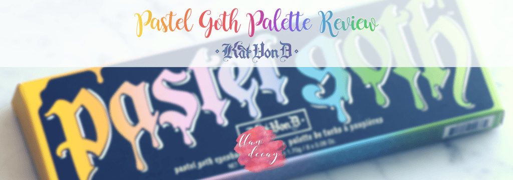
Pastel Goth (39€)
La paleta Pastel Goth es una edición limitada que contiene 8 sombras mate. Hay quienes han criticado el rango de colores porque no eran tonos pastel como tal (rosas, azules y lilas muy claros), pero tampoco creo que ésa fuera la idea de Kat Von D al crear esta paleta. De hecho, desde que la reveló me recordó a los colores básicos que hay en casi todas las cajas de pasteles de dibujo.
The Pastel Goth palette is a limited edition that includes 8 matte shadows. There are people who have criticized the range of colors as they thought they were not pastel enough (such as very clear pinks, blues, and lilacs), but I don’t think that was the idea Kat Von D had in mind while creating this palette. In fact, ever since she revealed the colors, they reminded me of the most basic colors in almost every box of drawing pastels — to which she might’ve paid tribute to, here.

Textura | Texture
No se trata de una paleta polvorienta, pero eso se debe a que es bastante seca, lo cual no me gusta demasiado. Eso hace que difuminarlas entre ellas sea un poco más costoso, pero no imposible. Para que os hagáis una idea las que la conozcáis, me recuerda a las sombras más secas de la paleta Tarteist™ PRO Amazonian Clay Palette (como Drama o Mood).
There isn’t much fallout in this palette, which is probably due to it being rather dry, and that’s something I don’t really like for eyeshadows. That makes it a little harder to blend them in, but not impossible. Just so you get an idea of how it is, it reminds me of the drier shadows from the Tarteist™ PRO Amazonian Clay Palette (such as Drama or Mood).

Pigmentación y Swatches | Pigmentation and Swatches
Las únicas sombras que me han dado problema porque no pigmentaban demasiado bien han sido Clementine (naranja), Meow (rosa) y Dope (lila). Estas dos últimas no tienen tanta durabilidad como el resto y desaparecen rápidamente, pero en general creo que las demás son muy buenas en ese aspecto. La pigmentación es bastante opaca en Dope, y por lo tanto es más difícil conseguir una consistencia perfecta.
I found Clementine, Meow, and Dope to be a little bit chalky, but overall the rest of the shadows were very nice in that sense. Meow and Dope didn’t last very long on the eyes, fading quickly after just a few hours. The pigmentation was mostly opaque in Dope, which made it extra hard to turn out seamless.

Aplicación | Application
La mayoría de las sombras se aplican sin problemas sobre los ojos, pero como ya he dicho anteriormente, Meow y Dope son más difíciles de trabajar. Su pigmentación es más pobre que la de las demás, de forma que el color se pierde muy fácilmente al encontrarse con el resto.
Most of the shadows apply without a problem, but as I’ve said before Meow and Dope are harder to work with: their pigmentation is poorer than the others’, so they get lost when blended with the rest.
Conclusión | Conclusión
Si hay algo que debo destacar de esta paleta es que es única. No he visto otra igual y no creo que haya otras marcas de tanto prestigio como Kat Von D Beauty dispuestas a hacer una paleta de mates pastel, los cuales son muy difíciles de hacer bien y vender (ya que la mayoría de consumidores de maquillaje se decantan por otro tipo de paletas más neutrales). Es una de esas paletas que o te encanta o no te hace sentir nada; perfecta para las amantes del maquillaje que se decantan por colores intensos y llamativos, pero completamente innecesaria para aquellas personas que no utilizan este tipo de tonos.
Lo que no me ha gustado de esta paleta (o lo que yo cambiaría, mejor dicho), es el rango de colores. Añadiría un negro y me desharía del gris, puede, porque creo que daría mucho más juego a la paleta y haría homenaje a la parte “Goth” de ésta.
If there’s one thing I must point out about this palette is that it is very unique. I haven’t seen anything like it and I don’t think we’re going to see brands as prestigious as Kat Von D Beauty creating matte and pastel eyeshadows because they’re so hard to do and most consumers will pass on it for not being their type of eyeshadow palette. It is one of those palettes that you either love or hate; it’s perfect for those who are bored of neutral makeup looks and want some intensity in the eyes, but completely unnecessary for those who don’t use these types of tones.
What I did not like about this palette as a whole (or better said what I would personally change) is the range of colors, to some extent. I would add a black shadow and I would get rid of the gray (if I had to) because I think it would give more play to the palette and would pay tribute to the “Goth” part of it.
¡Hasta aquí la reseña de hoy! Espero que os haya gustado, os dejo con un look que hice utilizando esta paleta y, spoiler, otra de la que también tendréis reseña pronto ♡
Until next time! I hope you liked the post ♡ To finish, here’s a look I did using this palette — spoiler alert: I also used another palette I’ll be reviewing soon!


Leave a comment